Introduction
The industrial and manufacturing sectors require an increasingly efficient production process to minimize expenses, enhance productivity, and deliver top-notch, lucrative products that can excel in a highly competitive market. In this context, we will describe the Pareto diagram as a relatively simple technique that allows us to identify the most critical problems within our production system.
In this article, we will discuss the significance of data in conducting effective analysis. We will explore how existing data from commonly used industrial systems, such as MES Shift Book, CMMS / EAM (Enterprise Asset Management), connected worker apps, and Microsoft Excel spreadsheets, can be utilized.
By leveraging AI, we can automatically generate Pareto charts that incorporate annotations made by workers during problem-solving activities. This approach ensures that our chart accurately identifies critical areas within the production process.
The Importance of the Pareto Chart in Maintenance
The Pareto chart, as a visual representation, plays a fundamental role in evaluating issues that may impact a production or maintenance process. Its great utility lies in its simplicity, as it provides us with the ability to easily identify where our problems are concentrated, allowing us to focus on them and prioritize the elements with the greatest impact, which leads to quick results in the general operational context. The Pareto principle states that 80% of the effects come from 20% of the causes. In maintenance, this means that a minority of problems are responsible for the majority of failures and breakdowns.
To gain a clearer understanding, let's consider a scenario where we are responsible for maintaining a manufacturing industry that utilizes an MES Shift Book system. When we analyze the collected data, we can observe that the failures in the top 20% of the company's equipment over the past year account for 80% of the production downtime. This finding enables us to focus our efforts on enhancing the reliability of this group of critical assets, leading to rapid and significant improvements.
In the aforementioned case, we observe that the number of failures is directly related to the amount of downtime, indicating a logical correlation. However, it is also possible to encounter situations where some equipment experiences a low number of stops but prolonged downtime, or where equipment has numerous stops with brief periods of downtime. Both scenarios lead to significant periods of production downtime and substantial repair costs.
Creating a Pareto Chart
We have discussed some of the features of the Pareto chart. But how do I actually create one of these charts? Below, we will explain the procedure for assembling this tool using information extracted from an Excel spreadsheet.
1. Maintenance Data Collection
The first step in creating an effective Pareto chart is to gather maintenance data from sources such as the MES downtime-logs, Shift Book, CMMS/EAM, connected worker applications, or a Microsoft Excel spreadsheet. This involves collecting information about failures, downtime, repair costs, associated systems, and any other relevant factors. Accuracy and consistency in data collection are crucial at this stage.
For example, we conducted a reliability consultancy for an oil company that had 25 operational oil drilling rigs. They collected all the information about events and failures that resulted in downtime for their rigs in Excel tables, similar to the one shown in Table 1.
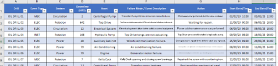
Table 1: Example of event data for oil drilling rigs.
In the table above, we have valuable and categorized information. Firstly, it provides details about the specific drilling rig where the failure occurred, the type of event, the system involved, the duration of the downtime, the equipment that experienced the failure, the mode of failure, and the actions taken to resolve it.
2. Frequency Analysis
In this stage, we analyze the frequency of occurrence for each of the identified types of issues. What is the frequency of each category in the maintenance data? This analysis provides information about the most common problems and the equipment that experiences the most issues. For instance, using the data provided in Table 1, we will examine the duration of downtime for systems, equipment, and drilling rigs.
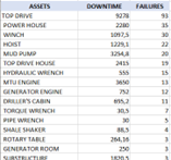
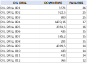
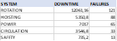
Table 2: Downtime Analysis Tables
3. Calculation of Relative Contribution
Relative contribution refers to the percentage of each category in relation to the total number of issues. This calculation is essential for determining the relative importance of each type of problem in relation to others. It is a crucial part of the chart as it allows me to identify the studied items that generate 80% of the impact on the process.
4. Creating the Pareto Chart
With the classified data and calculated relative contributions, it is time to create the Pareto chart. On the vertical axis, we represent the frequency or number of issues, while on the horizontal axis, we place the categories of problems or studied equipment in descending order of their relative contribution.
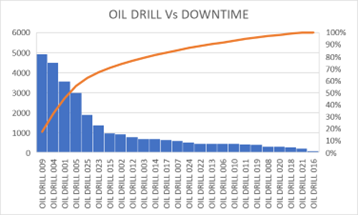
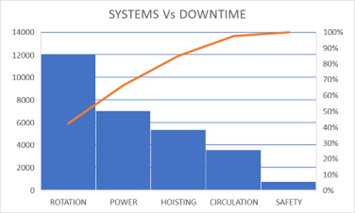
Figure 1: Downtime by Equipment Feature (Systems & Drill)
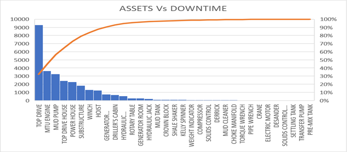
Figure 2: Downtime Linked to the Asset that Failed
5. Identification of Critical Areas
Once the Pareto chart is created, critical areas or equipment become evident, and immediate action plans can be implemented. By gaining a clear understanding of these crucial areas or equipment, the company can make better decisions regarding resource allocation in order to effectively address and improve issues. This may involve implementing preventive maintenance, predictive maintenance, staff training, updating operational procedures, and/or investing in new technologies.
In the charts presented in the previous chapter, it is clear that one particular asset, the TopDrive, is responsible for around 30% of the overall downtime. Furthermore, the top 6 pieces of equipment, which are the most significant in terms of representation, account for over 80% of the total downtime. These six pieces of equipment accounted for 17% of the total equipment that experienced unscheduled downtime during the study period. This relationship aligns with the Pareto principle.
Creating Pareto charts using maintenance documentation is an effective way to design maintenance strategies and plans in the world of industry and manufacturing. By proactively identifying critical areas, companies can reduce risks, costs, downtime, and maximize the lifespan of their assets, safety, and profits.
Your Maintenance and Downtime Documentation are Your Unused OEE Improvement Gold Mine
Maintenance documentation is an extremely valuable source of information that is often underestimated. The system records the complete history of our assets and their evolution over time. This resource serves as a treasure trove of knowledge that offers information on asset performance, incidents, downtime, repair costs, and other crucial aspects of the industrial and manufacturing maintenance field.
This documentation includes all the elements that are not working correctly in your production process, recording failures, incidents, and their resolutions. Likewise, it provides comprehensive information on the distribution of downtime, enabling us to determine the amount of time is spent on planned maintenance versus unplanned or corrective maintenance. This data is essential for making decisions to improve efficiency and effectively reduce unplanned downtime, thereby enhancing Overall Equipment Efficiency (OEE).
In the Pareto analysis presented in the example, we can observe the columns for "mode of failure actions" and "actions taken to correct failures." This information is highly valuable, although it is challenging to characterize because it involves specific terminology used by the workers who perform repair tasks. However, it is employed when conducting a more in-depth analysis, such as determining the root causes of issues, conducting Failure Modes and Effects Analysis (FMEA), or implementing Reliability-Centered Maintenance (RCM). These analyses help improve the procedures for critical equipment and systems identified through the Pareto chart.
Use Manufacturing Specific Text-AI solutions
In the previous section, we discussed the traditional approach to categorizing events associated with downtimes. Technology has advanced to allow radically different approaches to collecting and characterizing data for subsequent analysis. This has given rise to Text-AI solutions trained to understand the industrial world and extract and organize its data automatically. Here, we explore how these solutions can provide an efficient summary of problems and their resolutions.
Text-AI that Understands Industry Terminology
One of the key advantages of using industry-specific Text-AI solutions is their ability to comprehend and work with the technical and specialized terminology commonly found in industrial maintenance. This means that these tools can effectively identify and analyze industry-specific terms, acronyms, and concepts, making it easier to extract valuable information from your data.
Text-AI that Understands Your Company's Terms
In addition to industry terminology, industry-specific Text-AI solutions can also be customized to understand your company's internal terms and nomenclature. This is especially beneficial because each company may have its own terms and unique ways of describing problems and solutions. By having a tool that understands this personalized terminology, you can obtain a more accurate and relevant summary of maintenance issues.
Summarizing Problems and Solutions
By utilizing industry-specific TextAI solutions, you can acquire a comprehensive overview of downtime problems in your industrial and manufacturing maintenance environment. These tools categorize all maintenance documentation, find the big clusters, and automatically generate the Pareto chart. These solutions can analyze large volumes of data and identify important issues, recurring patterns, and potential solutions, all without requiring manual categorization or definition of category trees. This significantly enhances the efficiency of the information categorization process and, as a result, enables the timely identification of areas that require immediate attention. Artificial intelligence helps solve these problems. Data reading techniques based on Text-AI allow for reading both parameterized tables and worker comments, allowing these to be included in event analysis and used in subsequent action techniques such as root cause analysis or the execution of fault-handling procedures.
An example of this technique is the "peoplegeist" software, which can be integrated with various maintenance management systems on the market or analyze its data by reading an Excel page. , and automatically generate Pareto diagrams. With these charts, more accurate decisions can be made about where to allocate resources to effectively resolve or improve problems, possibly by implementing preventative maintenance, predictive maintenance, staff training, operating procedure updates, and/or investing in new technologies.
Conclusion: The Power of Pareto Charts in Reducing Downtime in Industrial Maintenance
The Pareto Chart is a high-impact tool in downtime analysis. It allows us to consolidate critical information into a single graph, highlighting areas that generate unplanned stoppages and disrupt the production process, resulting in increased costs and safety risks. This information serves as the initial foundation for creating maintenance plans and immediate actions that directly address the root causes of production stoppages, ultimately improving Overall Equipment Efficiency (OEE) in the production system.
Key points have been emphasized, underlining the importance and impact of the Pareto chart in reducing unplanned downtime. These include identifying critical issues, aligning the workforce through a unified problem-solving approach, and focused efforts to minimize downtime and address its causes.
The integration of the Pareto chart with industry-specific Text-AI models provide reports containing the most relevant characteristics for analyzing the criticality of problems that lead to unplanned downtime. By incorporating annotations made by workers during maintenance tasks into the analysis, this integration serves as a starting point for a comprehensive examination and the search for root causes, often using methods like the “5 whys”, which enables a deeper understanding of the underlying reasons behind significant issues and facilitates the development of effective solutions.
In conclusion, the Pareto Chart is a powerful tool that not only identifies significant problems but also guides us toward effective solutions. By strategically applying this approach, companies can achieve significant cost savings and reduce downtime in industrial maintenance, ultimately improving operations and maximizing efficiency in a competitive environment.